While we are no longer making active post of Cricut projects on this blog as of 8/1/2013, we invite you to use it for continued die cut inspiration as we will leave the blog up for viewing. Happy Cricuting !

Showing posts with label Cricut Expression. Show all posts

Saturday, July 27, 2013

Train Picture Frame

Happy Saturday Cricut Fanatics!  This is Rita from Rita's Paper Obsession.

Today I wanted to share a picture frame I created for a picture of my husband and our nephew.  We went to the train museum and I wanted to create a keepsake for our nephew.


I selected the train from the Carousel cart and used Design Studio to layout the frame.  The train image is 8 inches.  The window was too small for my picture so I used the hide contour and placed a 3 inch square from George & Basic Shapes in its place.  I cut this out three times on blue, green and red pattern paper and twice from chipboard.


Next using the shadow function, I welded a rectangle to the bottom of the image to give me a flat surface.  I cut this out of black pattern paper and chipboard.


For the frame back, I used the welded shadow/rectangle and used the vertical frame back from the Fancy Frames cart.  Again using the hide contour function I hide the rectangle utilizing only the stand portion of the image.  I cut this from chipboard.


To assemble, I glued the red train to a chipboard cut and the blue train to the other chipboard cut.  I hand cut the smoke stack and light off the blue train.  From the green train I hand cut the top of the smoke stack, the roof of the train and the cow catcher.  I cut circles from George & Basic Shapes to match the size of the wheels and I created a window frame by cutting a 2 3/4 square inside a 3 1/2 square.  All pieces were inked with Versa Magic "Jumbo Java"


Finally assembly of the frame, layer the train on to the shadow leaving an opening to insert the picture.  Adhere to the frame back.


The frame looked a little plain so I doodled some and added a number cut from the Lovely Floral cart.  The numbers represent the date we went to the museum.


Thank you for stopping by and allowing me to share with you this weekend.  It has been a pleasure being a part of the Cricut FANatics blog.  Happy Cricuting!

Designed by: Rita Poteat
Cricut Cartridges Used: Carousel, George and Basic Shapes, Fancy Frames
Cricut Machines Used: Cricut Expression
Project type: Home Decor

Monday, July 8, 2013

Gotta Wear Shades

Hello everyone!  This is Erika from http://EKittyScraps.blogspot.com  I can't believe it is July already.  I am very sad to hear the news that this is the last month for the blog.  I would wake up in the morning and read the blog daily.  I will truly miss this.  I will try to post another project or two before the month is over.  Here is my LO for the month.  This is another LO for my Stepson that got married last Summer.  This is Pre-wedding fun with the Best Man, Maid of Honor and Groom. 
All of the pictures have black backgrounds with either brown or cream colored frames.  Gotta Wear Shades was cut at 3/4 inches using the Shadow feature on the Platin SchoolBook Cartridge.  I could not cut that small without using the Shadow feature.  Too much tearing of the letters on the mat.  The shades were cut at 3/4" and 1/2" (square shades) using Paper Dolls Teen Scene on page 56 and (girly shades) Forever Young cartridge from page 47.  The lens's were cut a 1/4 inch smaller to fit the frames better.   

The banner was cut from the Artiste cartridge on page 66 on kraft paper.  I then used my Festive Berries Distress Stain to color the banner.  Only took a minute or two to dry.  I used pop dots on the banner and all of the shades on the LO to add height.

I added song lyrics about sunglasses to both layouts for fun.


I backed the song lyrics with black paper.

I inked "Gotta Wear Shades" with Vintage Photo Distress Ink to help stand out. 


You now can see the pop dotted sunglasses fron this angle.


I hope you like my LO and Thanks for stopping by. 

Materials Used:
Cricut Expression Machine
Cricut Cartridges: Artiste, Forever Young, Paper Dolls Teen Scene and Platin SchoolBook
Silver and Gray Paper from The Formal Stack by DCWX
Kraft paper
Festive Berris Distress Stain
Vintage Photo Distress Ink
Pop Dots, glue 


Tuesday, July 2, 2013

The First Few Years layout

Hello Fanatic friends. Cindy here from Scrap-obsessed.blogspot. I recently purchased the new Cricut cartridge called The First Few Years. I am loving the layout ideas and how simple it is to get everything cut out because the booklet tells you exactly what size to cut each piece. I started at the beginning with the first layout.


My son and daughter in law just announced they are going to have another baby girl. She is due in October, so I thought it would be nice to have some layouts ready for her arrival. All of the cuts are from the First Few Years cartridge except for the butterflies. I made those using a couple of punches from Stampin' Up. All of the purple and gray papers are from Stampin' Up. I also used Wisteria Wonder ink to sponge the edges of each piece.

Cut sizes:
Photo mat 9.75"
Banner on top 2.25"
Title 1"
Baby Carriage 3"
Circle under carriage 2"
Tags on the left side were both cut at 2.25"

I hope you like my project today and will stop by my blog for future layouts from this cartridge.

Monday, June 24, 2013

Thanks Teacher


Hello this is Terri from www.scrappinwiththebug.blogspot.com. Where oh where has the year gone. I can't believe it's JUNE already. I must admit I almost missed the post for today - as the month totally got away from me.
 

So we all know I love love love playing with vinyl. So a few months back before school was out for the summer I made these. My daughter went  2 years to the same preschool. While, I was a little nervous about her going 2 years ago my daughter's teachers put me at ease. They were simple the BEST. They genuinely loved kids. So I wanted to make these fun flower pots for them as a HUGE thank you gift.
 
I used pots I found from Michael's. They were 50% off when I bought them.  The one teacher likes purple and other green/blue. So I thought these were perfect.
 
I cut the words from white vinyl. I used billionaire and welded the words together. The words are just over 1.12".
 
The saying, "Thanks for helping me grow". The teachers loved them so much.
 
I know it's a super quick and easy project but the result and gift was fantastic.
 
I kiss cut the vinyl by turning my blade to 3, pressure to 3, and speed to 3 or medium.
 
I then used washi tape to transfer the words to the flower pots.
 
And I leave you with my love of this fun little project. Lots of people know I love my Blackhawks. My hubby is a true Chicagoan - me a transplant Chicagoan (I grew up down state IL). I love watching hockey. My MIL a few years ago bought my daughter this hockey Jersey and I had to make a photo layout with it. I used PKS face on the little hockey girl. The  girl was made from paper dolls and she is 3". As you can see this is from 2010 -- so with them winning the STANLEY CUP I guess I should make another layout of her w/ a 2013 cup....


Designed by Terri Szymanski
 
Gypsy and Expression used
 
Cartridge: Billionaire cut at 1.12"
 
Supplies: White Vinyl


Thursday, June 20, 2013

Sketch Challenge #8

Welcome to our Sketch Challenge.  
This is Amy from Amy's Digi Scraps and welcome to the another Sketch Challenge! On the 20th of each month, I will post a sketch for you to enjoy!  I generally post a card sketch with a card that I create, but you can make it a layout as well.  Please visit the Sketch Challenge link for more information about our monthly Sketch Challenges.

Here is the sketch for today:


And here is the card I created for it:


This sketch was created as part of a class I will be teaching locally.  It is similar to what is known as a One Sheet Wonder, where you create several cards from one sheet of printed paper.  This class will allow the participants to create 17+ cards using very minimal supplies, adhesive, inks and stamps.  I will have the entire class and patterns available on my blog after the class has finished.  My purpose for these cards and the class is to encourage new card makers who want some creativity without having a lot of bulk or "extras" on their cards.  To show that simplicity can be beautiful.
 In addition, I am asking those who take the class to consider donating one or two of the cards they create in class to Operation Write Home (OWH).  This is a wonderful organization that sends blank cards overseas to our military so they have cards to send home to their loved ones.  Stationery supplies are not a priority there, so the cards really do fill a need.
I used paper that I bought in bulk from Tuesday Morning for both the printed paper and the solid color paper.  The stamps and ink are from Close To My Heart.
Now - what makes this class - and card - so fun for the Cricut Fanatics blog is that all the cuts are done by the Cricut Expression machine and George Cartridge!  Again, once the class is finished, I will share the information, but I drew out the cuts I wanted and then designed it on my Gypsy machine to cut with my Cricut.  The cricut doesn't cut all the way to the edges of the paper, but this is a simple cut with my scissors to finish separating and this saves a lot of time, measuring, and errors!!
If you've ever been in a class that requires a lot of cutting, you know how easy it is to get lost and make the wrong cuts, even with the diagram in front of you.  Having taught these classes before, I know how it can slow down the class, as well as create problems with paper waste.
By using my Cricut to cut these multiple, simple cuts, I am able to keep the class moving forward, plus promote the Cricut machine and Gypsy.
Some edge inking, a little bit of stamping, and glue everything down and presto! 17 different cards (or more) in under an hour.


We would love to see what you can do with this Sketch.  Please create a card or layout and upload the image to this post in the InLinkz!  Remember that you must use your Cricut in creating your project for the Sketch Challenge.

Saturday, June 1, 2013

Die Cut Tip Tutorial - Themed Layout Design

Hello Cricut FANatics. Its Debbie O'Neal of Scrap Me Quick Designs.  Happy June 1st to you all !  Hard to believe the summer is here already, isn't it? Our lives are currently filled with end of school activities, graduation parties, weddings, summer vacation planning, summer camp trips, etc.  I think it is one of the busiest times of the year, don't you?

Speaking of summer camps, last year I helped volunteer at my granddaughter's Girl Scout Day Camp. It had a western theme with lots of great western activities, crafts and games.  Of course, I took a ton of pictures and wanted to scrapbook them but wasn't sure how to go about capturing the fun of the photos with the theme of the event.  That lead me to think about Layout Design and using my Cricut so I wanted to share some tips I used to create this page for our Die Cut Tip Tutorial - Themed Layout Design.

 
Die Cut Tip Tutorial -  Themed Layout Design
 
Step 1: Find Die Cut Images on your cartridges that fit your event theme and support your photos.
           
My Example:  I used the Old West Cartridge and selected images that worked with my design idea of game playing and western.
 
Step 2: Determine how many photos you want to use on your page and possible placement.
Begin by selecting your focal point photo and creating a photo mat to emphasize the importance of the photo.
 
My Example: I had this one great photo of my granddaughter all decked out in her western garb (don't you love that fake mustache???) so that was my focal point photo.  I made my own Wanted Poster as the photo mat to continue to emphasize the theme.
 
Step 3: Determine a title (and subtitle if wanted )for your layout and cut out the letters and images
 
My Example: I thought about how she looked like a real "desperado" and came up with the "Armed & Dangerous title and "ready to play" subtitle to again play up the game playing aspect.
 
Step 4: Create some embellishments for your page with your die cuts and size them to fit the areas on your layout where you will place them.
 
My Example: The sign on the Old West cartridge seemed like the perfect subtitle spot and then I created the cards and card box to play up the game playing theme.  I needed one more embellishment to balance out my page and decided to use the cactus to emphasize the western theme. 
 
Tip: Make sure and enhance your die cut images using ink and markers, etc. to add more dimension to your images.  And don't forget that pop dots really help add that wow factor to your die cut placement on your layouts too !
 
Hope this Themed Layout Design Tip gives you some insight on how to take your die cut images and create your own themed layouts.
 
Cricut Info & Supplies Used:
 
Design by: Debbie O'Neal
Cricut Used:  Expression
Cricut Cartridges: Old West
Other Supplies Used: Cardstock, patterned paper, distress ink, marker pens, pop dots


Tuesday, May 21, 2013

A Sweet Treat

Good morning everyone. I'm L.B. from Cool Beans By L.B. I hope everyone is having a wonderful day. I try really hard to create more masculine themed cards to share with you,but right now I am overflowing with female birthdays so I am fun wobble card I created for a good friend.
I love this old school DCWV paper from the Sweet Stack. It layered just right on the birthday girls favorite color.
Next came the cute cupcake off of Simply Charmed, of course I have a habit of cutting of the cherry topper. I embossed the icing with my Swirls folder then added gems using some Stickles and tiny gems. I also added Stickles to the cupcake wrapper.
 I had never put gems on this way before but it turned out great and they all stuck on quite well. After everything was all dry I attached my cupcake with an Action Wobble.
 I hope everyone is having a wonderful day. See you next month!

Project Details:
Made by: L.B.
Cricut Cartridges: Simply Charmed
Other Supplies: Swirls embossing folder, DCWV Sweet Stack paper, Stickles in Cotton Candy and Lavender

Saturday, May 18, 2013

FATHER'S DAY GIFT BOX

Sorry about the delay... I picked the wrong date so it didn't post at midnight...lol

Hi, it's Freda from CannCreate Designs, I'm back with a quickie 3D Father's Day gift box project using SVG files, MTC and my Expression. 

I was looking for a gift box for my hubby's father's day gift.  He has been wanting a new wallet so I though the size of this box would be perfect...


This project comes from "The Green Room" set at SVGCuts.com.  I was really amazed at how easy and quickly this project came together.

For the top I found this great green velvety specialty paper from HOTP called Forest Suede at my local LSS that cuts like butter.  Just to be certain I taped it down all the way around so I didn't waste an ounce......


I assembled the top before I decided the "balls" looked a little flat.  So I would advise that you assemble the rack of balls and embellish before attaching to the table....I was a little worried that I was going to mess up the suede.  Draw stripes and dots on the ball pieces, assembled rack base and frame then glued the balls in place on the rack base piece.  Place rounded blobs of Glossy Accents on each ball to make them look a little more realistic....let dry...


Use a tape runner adhesive to attach the velvet to the table top base. Next put the table top frame in place and embellish as desired.  (I put Queen & Co. black gems in the holes around the edges).  Draw the embellish lines (gold and black stripes) and color the chalk tip white on the stick, allow inks to dry then color the white tip with a little bit of blue on the end. Fold the stick along the scored lines and glue (it will be a square shaped tube). There are 2 holes in the suede to help with placement of the ball and stick, I placed a pearl on one and glued the stick to cover the other one...

Fold the sides of the table top under and glue in place.  Glue the "fringe" pieces along the long side (there aren't any pieces for the short sides of the top).  I put Queen & Co. large black pearls just above the holes cut in the fringe pieces.


For the bottom of the table fold the "Box" pieces and glue to form the table base, they are pretty self-explanatory.  Glue the 3 straight and scalloped trim layers together and glue in place on the leg pieces.  Attach the leg pieces to the long sides of the box.


Wallah....you're done....What Fella wouldn't enjoy getting a gift in something this special.....I thought this project was pretty special as a gift box...but last week someone made the bottom of the table and filled it with flowers to look like a planter-I thought it was even more amazing....check it out here...
  

Thanks for stopping by, 

Freda


Designed by:  Freda Cannon 
Machine Used:  Cricut Expression
Project Type:  3-D Gift Box
Products Used:  MTC Software; The Green Room SVG Files from SVGCuts.com, Glossy Accents, Queen & Co Pearls and Black Gems, Ink Gel Pens.


Thursday, May 2, 2013

Life is Beautiful Layout

Hello crafters. Cindy here from Scrap-Obsessed. Sorry I'm late today. I was trying to finish up today's project and realized I didn't have the right pictures to go with it. It was originally supposed to be a layout for Mother's Day, but I didn't have pictures of my mom that I could use. What I did have sitting on my desk were lots of pictures of our new puppy, Coco Puff.


Sorry the picture is crooked. I was trying to hurry and used my phone instead of my camera.

With this layout today I wanted to show how you can take a paper kit and add few Cricut elements to dress it up a bit. All the paper and stickers are from a paper collection called La Belle Vie at Close to my Heart. It was in last year's catalog and I've had it sitting in my room collecting dust until now. I really need to find more time to use my supplies.


On the left side of the layout I added a butterfly and flourish from Art Philosophy. On the right side I added another butterfly, flourish, a couple corner flourishes and our puppy's name.


Close-up of a flourish and Coco that was added.


Here is a close-up of one of the butterflies.I cut the bottom and top layer with the same paper just to add a little dimension. Then I added a few pearl accents.


All Cricut cuts were made from the Art Philosophy cartridge.
Butterflies were cut at 1.25" from page 55
Long Flourish's were cut at 1.25" from page 59
Corner Flourish's cut at 3" from page 58
Coco cut at 1.25"

Friday, April 19, 2013

WESTERN HOME DECOR PROJECT & GIVEAWAY!!!


Hey there, it's Freda from CannCreate Designs with another 3D project
from SVGCuts and MTC using my Expression.
This project has was made for the top shelf area of my scraproom desk...
makes me smile every time I look at it.


As soon as I saw the Happy Trails set of designs I knew I had to make it using a picture taken at Sears years ago of my grandson in a hat.  The wanted poster was originally intended to be a card, but I wanted it on a 12 x 12 canvas so I enlarged the file to fit the canvas. I purchased the Sasparilla Collection papers by October Afternoon to use because I LOVE the comic strip cowboy paper included in it.
 
Paint the sides and a little on the front of the canvas black and let dry. Trim the background paper to 11 3/4" and apply to the canvas with Mod Podge and let dry*.  Use Black StazOn to ink the edges of the paper once dry. 
 
*NOTE:  In a previous project years ago where I used Mod Podge and didn't allow each layer to completely dry before adding next layer I wound up with bubbles and buckling of the papers once the final project was completely dry.  I flip the project over and brayer the open area of the canvas and use the Cricut spatula to rub under the wooden frame area.  I haven't had any bubble issues since using this technique.
 
Enlarge the Paper, Text and Frame files from the Wanted Poster Card folder to fit on the 12 x 12 Mat angled slightly then cut it out.  (Be sure to cut your frame and text out before printing your photo, you will need to measure the area of the frame you cut to get the correct size for your final picture...speaking from experience....lol.  Ink the edges of the Paper file and mod podge to the canvas and allow to dry.

I'm so glad I bought the digital files so that I could tinker with it.  I had the photo reprinted on matte paper but found it was to "new" looking for this project.  So I opened it in Photoshop and ran the wanted poster action from Panos Effects Old Papers Action Set which I had purchased years ago, you could also use the built in Sepia tone action since the final product you're looking for is the photo.  I used the Wanted poster action because you can try out different items like bullet holes, stains, nails and cracks etc. for cool effects on your picture, if you don't like them you just hide or delete them.  When the photo looked "right" to me I cropped the file down to just the photo approximately 1/2" larger than the size needed for the area on the frame where it will be placed which you cut previously.  I printed the photo on cardstock and used a pair of decorative scissors to trim the picture down to approx. 6" squarish , distressed the edges then inked with StazOn.

Assemble the frame, text and picture layers then mod podge it to the "Paper" layer.

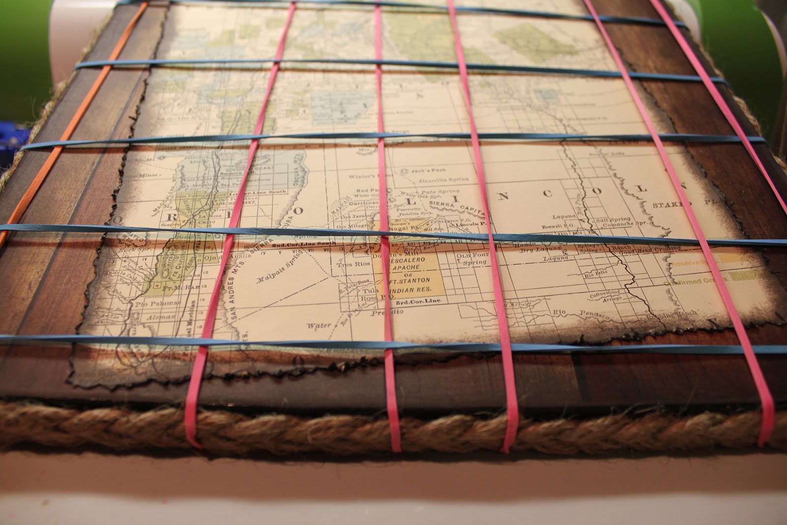
I thought the frame still needed a little something extra so I braided 9 strands of jute into a large flat braid and placed it around the sides of the frame, and a small braid for the hanger.

 
I stapled the start of the braid at the top of the frame and glued it around the sides with Zip Dry adhesive.  I trimmed the excess and stapled the other end where they met. I didn't like the appearance of the staples so I cut some jute to create a "fuzz", spread Zip Dry over the stapled area and pressed the fuzz into it...now you can't see the seam or staples.  I also did this to cover the staples on the hanger so they wouldn't scratch the wall when I hung it up...  I used large rubber bands around the outside to hold the braid in place while the glue dried.


The tag was made using Tim Holtz Distress Inks on a manila tag from the office supply store.  The lettering & banner came from Sizzlits dies Typeset and Tattered Banners.  The heart was a grunge board shape that I inked and fiddled with for 2 days to get it just right then couldn't wait for it to dry naturally.  I used my heat gun and wound up getting to close and suddenly had volcanic like eruption of paint and ink-My beautiful heart was broken.  I thought about it for a minute then covered the entire thing with red glitter, then drew lines of glue across the heart and applied gold glitter....let it dry without the heat gun.  The next night I applied Glossy Accents thickly and let it dry for a couple days.  Add a jute string and "fray" the ends and your tag is ready to be added using pop dots.

The boot and the pot were assembled using the video instructions on the SVGCuts.com website.  The boot itself was a little tricky on the front area, but they explain it quite well in the video...I couldn't even begin to explain.  Unfortunately I assembled the boot & pot at a crop and didn't take to many pictures of the assembly process.


You might notice that I changed the orientation of the horseshoe before cutting it out.  My grandma always said if you turn a horseshoe up side down all your good luck falls out...lol...I'm superstitious so I used the software to move the assembly tabs to the bottom of the shoe so my good luck doesn't get poured out...
 
 
Now for the Good Stuff-The Give Away:
 
If you would like to try your hand at assembling the boot but don't have the ability to cut one, I cut an extra boot to give away.  This will come unassembled, it has been inked and embossed you just add the glue...lol....
 
Embossing folder not included....it's in the picture so I can remember which one I used

 
Mary has a really detailed video tutorial that you can watch to help you with the steps of assembly and of course I will gladly answer any questions you may have just click the link to see it on Youtube: 
 
 
To win all you have to do is leave a comment on this posting. Don't forget to put your email addy in the comment section so I can contact you for mailing details....I will put the names in a hat, draw and post the winner Friday, April 26th.  Everyone is welcome to enter.
 
Thanks for stopping by and good luck!!!!!
 
Freda
 
Designed by:  Freda Cannon 
Machine Used:  Cricut Expression
Project Type:  Home Decor 
Products Used:  MTC Software; Happy Trails Svg files; Sasparilla Collection Paper by October Afternoon; Mod Podge; StazOn Ink; Photoshop Software; Panos FX actions for Photoshop; Tim Holtz Products: Typeset Alphabet, Tattered Banners and Grungeboard Heart, Martha Stewart Red & Gold Glitters, Glossy Accents, Twine and Jute.